Posters Instructions & Templates
Posters Instructions & Templates
Discover valuable tips, tricks, and templates on this page to assist you in preparing your poster effectively for the EASL Congress 2025. Ensure your presentation is both informative and visually engaging by following the below recommendations.
Format instructions
Dimensions:
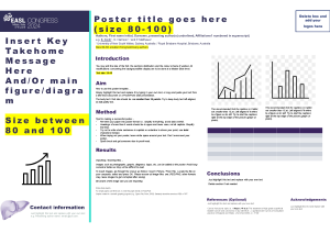
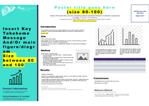
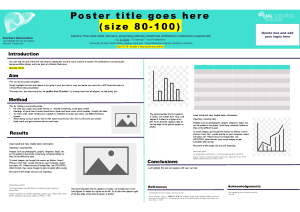
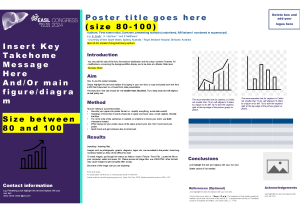
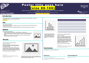
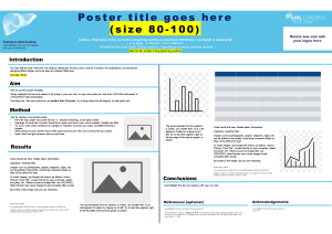
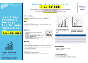
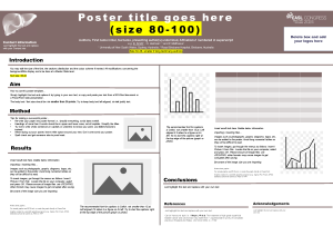
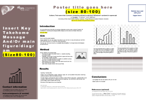
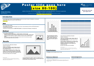
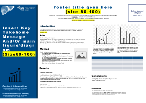
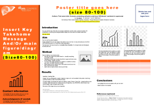
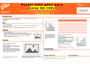
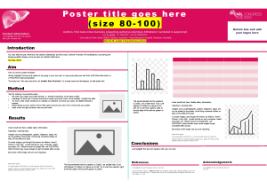
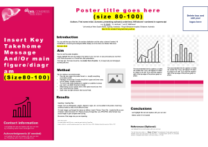
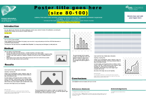
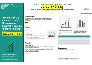
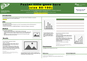
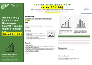
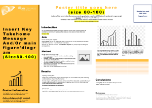
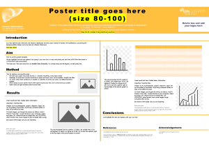
Use of our templates is not mandatory. Presenters are free to submit their own designs and colour schemes. This template is 140cm wide x 90cm high.
Remember that all the images outside of the white area WON’T be in the final version of your poster.
Sections:
The following sections should appear set out in clearly differentiated blocks:
- 1st Author and other authors with study centre or institution
- Introduction and objectives
- Methods
- Results and Conclusions
- References/Bibliography
Layout:
Title: We recommend between 80 and 100 pt, although if you have a long title, you may find you need to use a slightly smaller font size.
Institutions:
The institutions the authors belong to should be stated, indicating also Department and Unit. We recommend between 30 and 36 pt. Again, you may need to go below 30 pt if you have a longer text.
Text:
We recommend 36 – 40 pt, although 32 pt or even 28 pt could be used in isolated areas or if you have a very large amount of text. You should use dark text colours on a light background, or vice versa.
Identifier/Topic:
The posters should be identified with the topic or category to which they belong. For example: Miscellaneous, Epidemiology, etc.
References/Bibliography:
We recommend 24 – 30 pt. The presenting author must be registered for the congress.
Exporting:
You can either save this PPT or export as PDF. Our website supports both PDF and PPT.
Other considerations:
Cutting and pasting images doubles their size. We recommend that you use either Insert Image From File (PPT2000/2003) or Insert Image (2007/2010). The scientific committee reserves the right to modify the prior classification of the authors as oral presentation or poster.
Side band:
For all posters ordered, the PosterSessionOnline Technical Department adds a discreet band on the right side, measuring 5 cm, containing:
- The poster number
- The topic and 1st Author
- QR Code (QR Code will take you to the poster in the virtual gallery)
- The sponsor’s name (this part only appears if the poster service is supported by a sponsor)
IMPORTANT:
Please, check your poster carefully before submitting. Once the poster has been printed, we regret to inform that any modifications will not be possible.
If you have any queries, please contact us for help.
Content instructions
Poster presentations form a cornerstone of scientific communication and are a fantastic opportunity to showcase your research, get feedback on your work, improve your visibility, and forge new collaborations.
For Young Investigators, a poster presentation may be the first experience of an academic conference or the beginning of the path towards greater scientific autonomy.
Good posters take time
Leave yourself sufficient time to compose, modify, and refine your poster.
Ask yourself: “What is the one thing I want my audience to learn?”
Good posters have clarity and focus. All figures and text should help drive home your message. If it doesn't help your message, then leave it out.
Be bold!
Make the strongest statements your data can support. Use your title to convey your most interesting finding.
Help your audience interpret the data
What do your findings actually mean? Why are they relevant to the field? How do they advance our understanding?
Conclude with your main take-home messages
Leave your audience with up to 3 key points in the conclusion. They should be easy to find, relatable, and succinct.
Keep it simple
People remember simple messages. Use straightforward language and short sentences. You should prioritise being impactful over being comprehensive.
A picture tells a thousand words
Figures, graphics, and graphs should dominate your poster Make these the focal point with the text playing a supporting role.
Size matters
Make things big. People will not engage with a poster that is hard to see. Make the font and image size proportional to importance. Tip: Print out your poster on an A4 sheet of paper Is everything clear? ls everything readable?
Walk the audience through your poster
There should be a “flow" to your poster. It should be clear what comes first what comes next, and where the poster finishes. Use very clear headings and numbers to help with navigation.
Check in on your poster at the Congress
Your perfect poster is now on display! Keep “checking in” or your poster throughout the Congress. Engage with delegates. Invite questions. Sell yourself & sell your research.
Poster templates
Discover below a selection of poster templates as per topics, as well as generic EASL Congress 2024 templates. Click on the image to download the template.
